
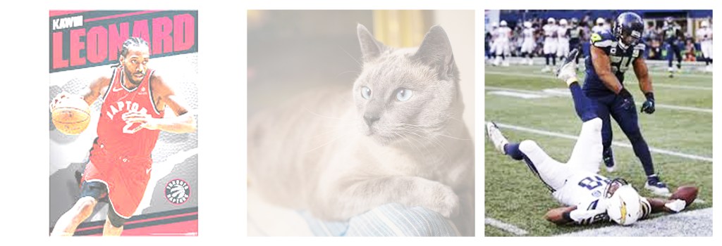
During this Altered Images assignment, we learned about the basics regarding how to manipulate pixelated images in Photoshop. We used websites to find royalty-free images, sent them to Photoshop, and experimented with the different effects. For these images, I used different blending modes and altered their opacities.
We learned about how some files are compressed, and how working with a photoshop file (.psd) is like a recipe that you’re going to lose when you export them/ convert them to another type of file. It’s a one way street and you can’t go back. A JPEG is a compressed file format, and this allows for your work to be quickly downloaded and transmitted, because all of the layers are removed in this format. Additionally, because the images in Photoshop are pixels, there is a limit to the quality of image that we can support, and resizing images will affect quality. Programs in the Adobe Suite save every little aspect of your work, and they work your computer, so transferring these images requires file conversion. Additionally, we used 150 ppi resolution, because this is the quality used when printing.
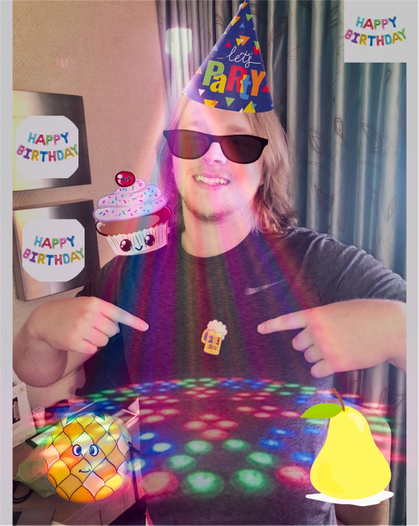
This assignment involved making a lot of quick selections and making layer masks before converting to the final copy. I used 150 ppi (printing quality in an original 12×12 canvas, that was slightly altered using the Artboard tool. I wanted to have a layered effect to the presentation, so I included the lights show image at a significantly lower opacity. I tried to make use of the negative space, and included a border around the outside of the design. This picture was from my 21st birthday, so I figured that I’d add some interesting, animated fruit to recapture what that moment was really like.
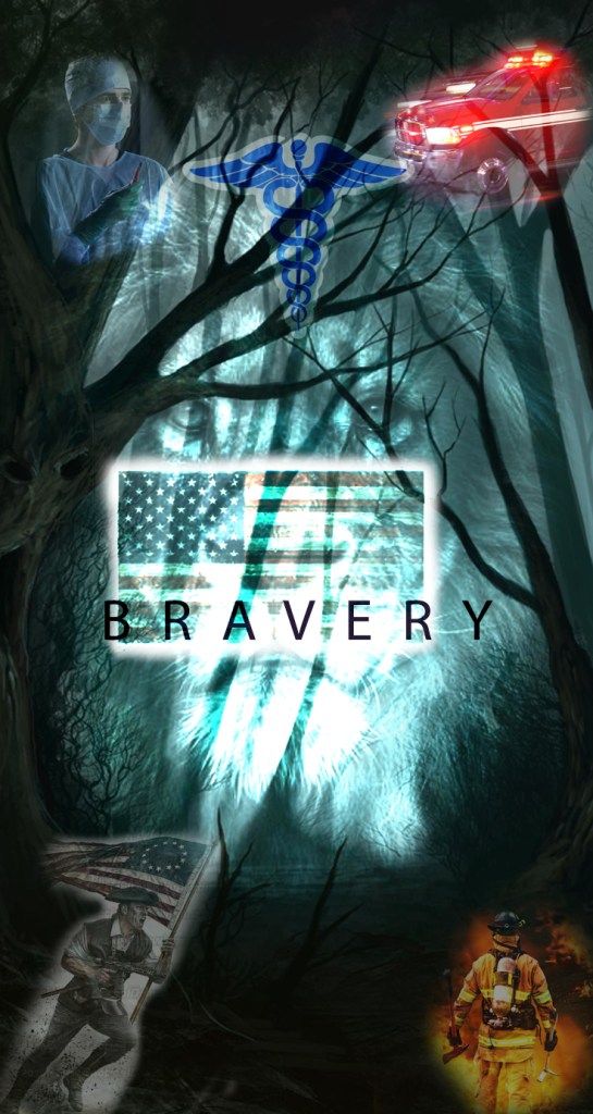
During this project, we learned how to use non-invasive techniques (essentially, ways to alter an image without deleting pixels) and layer masks to alter a series of images. We learned about the hierarchy of a design and how it is largely determined by where the prospective viewer will look, and in which order. I turned this into a social awareness poster, in part to bring attention to admirable, courageous professions and to let the viewer know that I think this is an important aspect and characteristic of our collective history as Americans.
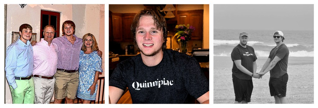
During this exercise, I altered the blending modes and color modes. I altered the hue, brightness, and experimented with different contrasts as well. There was considerable glare the middle and right photos before retouching, but I was able to adjust their presentation using these techniques. There is also an artistic aura that I wanted to incorporate into their final versions.
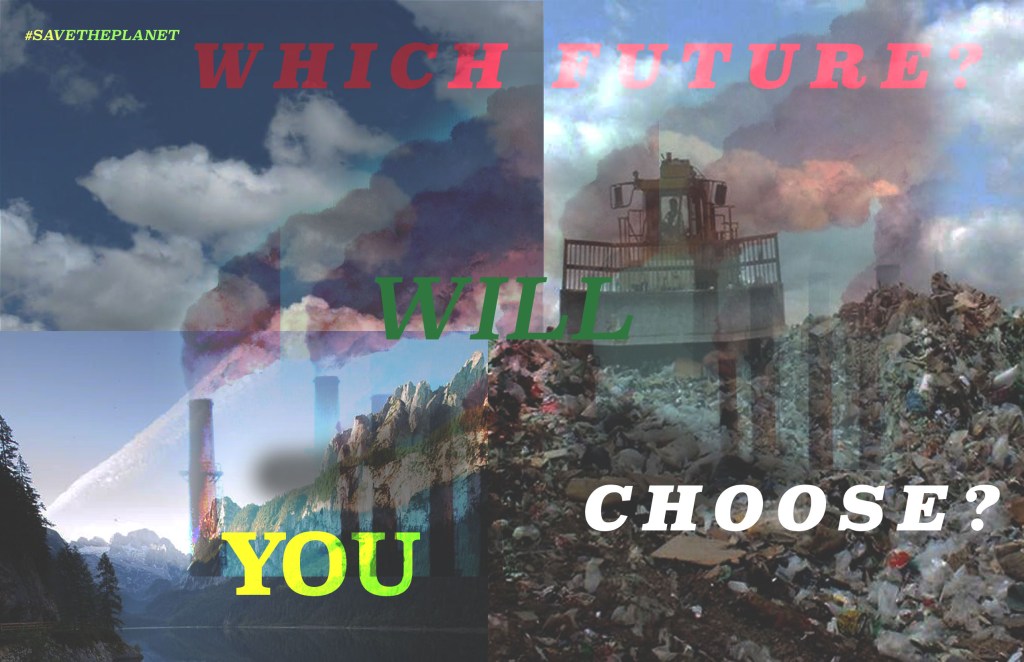
For this poster, we had to research a social awareness issue that we wanted to promote, and I decided to make an environmentally-conscious poster. I used layer mask-created smoke stacks to show a cause of pollution and used the clone stamp tool to create an upward array from the two parts of my poster (the left side showed a beautiful nature landscape while the right side was an ugly landfill). I altered the exposure settings and opacity to make my text stand out and to give it a grim overtone, which I hoped would convey a message of an ugly future and provoke the reader to feel compelled to do something. I made the CHOOSE text box white to stand out and convey the message that the average person reading this can do something themselves to help.
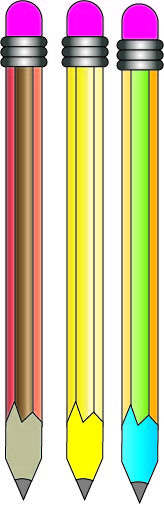
During this project, we learned the basics of Adobe Illustrator. We learned how to control dimensions of different shapes, how to align them properly, among other things. We also learned how to alter shapes using the pen tool curvature and make realistic alterations to the pencils. We also learned how to use the pathfinder tool to combine shapes. We learned about swatches and how you have so many options when coloring. We also learned about the basics of filling shapes.

During this lesson, we learned about the different swatches that are available in Adobe Illustrator. We experimented with different color schemes and learned how to organize the colors and access them while working in Illustrator. We also learned about gradients and how to apply them to give a glimmering effect. Some of these swatches, however, naturally mimic the gradient tool.
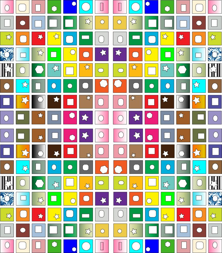
During this assignment, I learned about how to reflect large-scale images across their axes, creating a more symmetrical and complete image. During this project, we learned how to create a grid of 49 boxes and then reflect them in different ways. We learned how to group shaped and how to use the alt-option function to center shapes on a grid. We also learned more about the Ai layout.
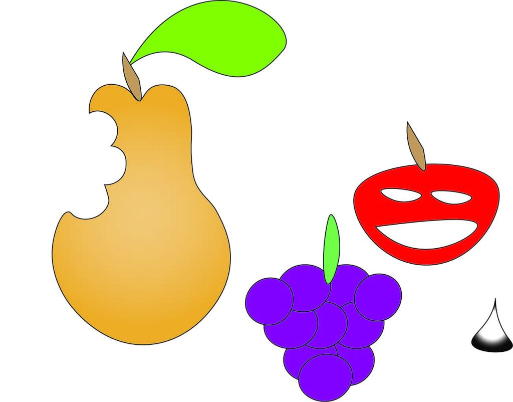
We learned how to use some of the functions in Adobe Illustrator, such as the curvature tool. We learned how to give a sleek, slender look to the images that we edit, and learned more about the pen tool. The curvature tool was specifically used to make those realistic bite-mark grooves on the pear. The concepts of where to place anchors points was also covered during this assignment, and we had some creative freedom regarding the background objects.
In this project, we learned how to use the pen tool to trace various logos. We had to learn to adjust with the curvature tool in order to properly fit tracings to the outlines of the logo designs. We practiced changing our anchor points and in general, getting used to the software was important. The Tesla design was particularly interesting. It wasn’t quite as difficult because of the intermediate elements of the logo. Even though it was quite tedious, that was personally my favorite.
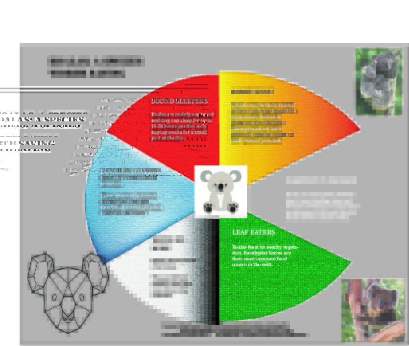
For this project, I wanted to create a circular infographic because from a perspective of hierarchy, the text is the only differentiator. I used white Sans Serif text because of how legible I thought it was to the prospective reader for my “Habitats in Danger” slide. I thought this slide was the most important and significant because it brought awareness to the underlying issue, that deforestation and human interference has destroyed their habitats over the years. I used gradients within some of the triangular segments of the infographic for visual effect. I also adjusted and staggered the layout of these segments after seeing a similar layout on some Pinterest pages. I kept a simple, cartoon drawing of the koala in the middle to show their loafy, carefree disposition, which I believe makes them very interesting to tourists that come and see them in their natural habitats.
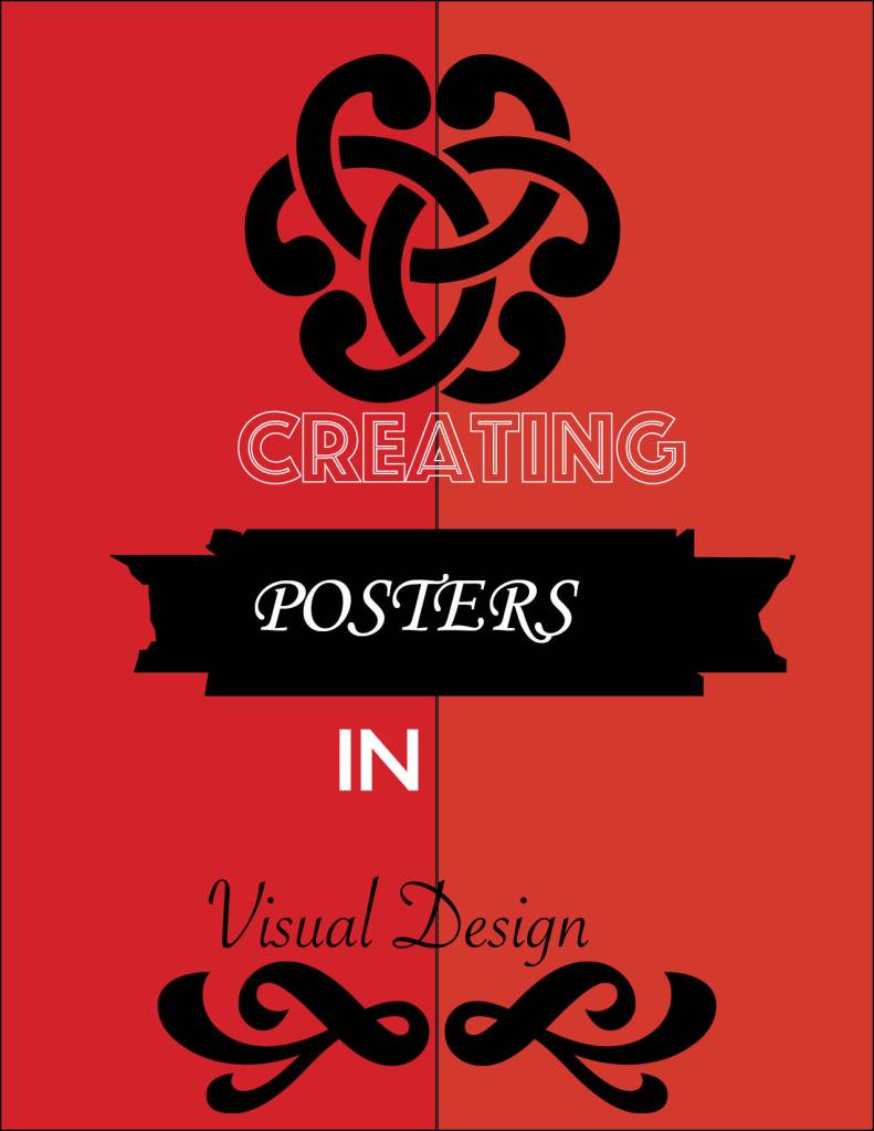
During this assignment, we opened a zip file and used its contents to make a simple poster design. We learned to use the file-place function to unzip these files and got to know how important placing a text box was when importing text into InDesign from other Adobe applications. Also, the linked palette is used to edit InDesign designs in other programs, and the changes are automatically saved in InDesign. You also align your text by using paragraph functions.
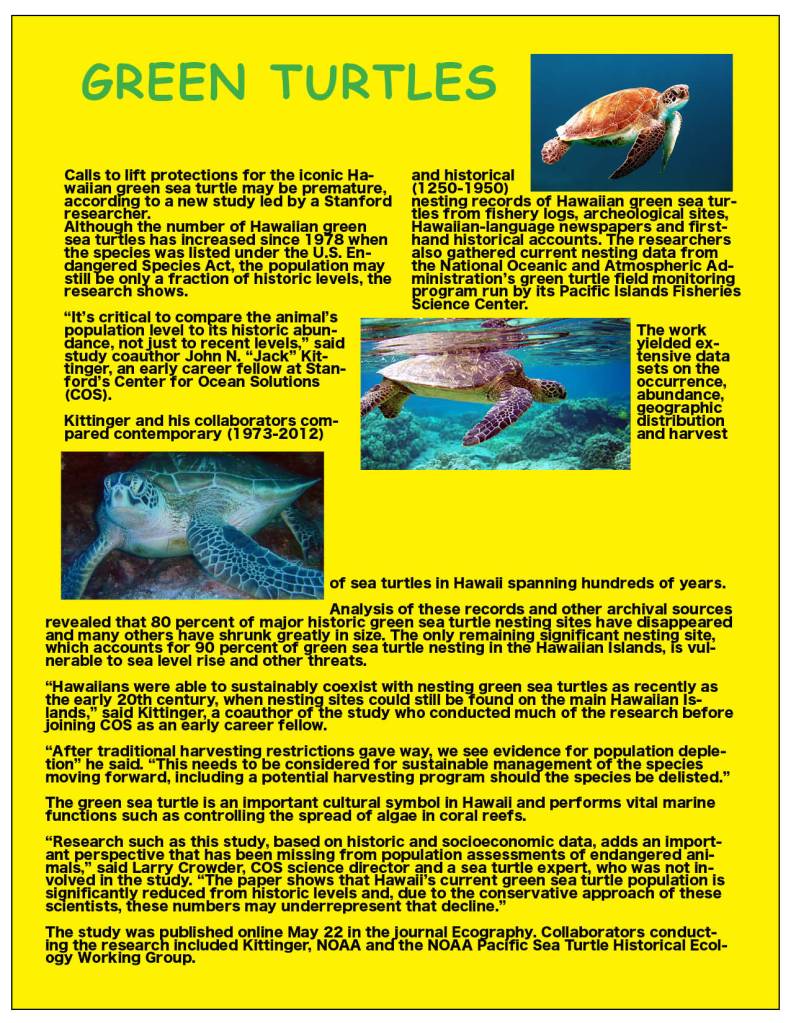
During this assignment, we furthered our knowledge on the Adobe InDesign program and its features. We learned how to change the presentation of text by adjusting column restraints. We also learned how to input images in from a condensed zip file by using the “File- Place” function and used the Wrap around text options and modified text boxes to shape our overall presentation (words and pictures). We learned to used readable fonts (like Sans Seriff) and that we should save and transmit our work through PDF files, and that we should be weary of our work because InDesign files don’t always save the same way, every time. The plus function on the side of our work also allows for an additional dimension for allocating text that isn’t presently shown, and can be utilized to break up text effectively.

